 |
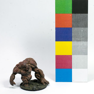
| 1: White background |
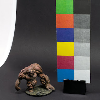 |
| 2: Black background |
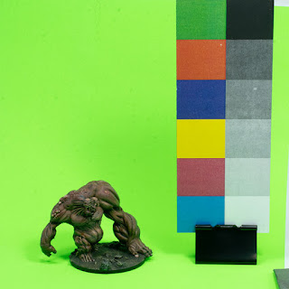 |
| 3: Fluoro green background |
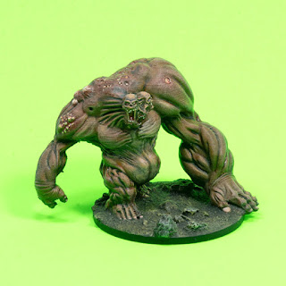 |
| 4: Fluoro green — no swatches |
I've been experimenting for a while with using a colour and tone swatch card in an attempt to get more reliable colour balancing and exposure with the automated controls of my camera.
It can only help so much with strongly coloured backgrounds though; you can see that there's considerable colour contamination from the green background, but that's due to reflection, not the camera's own colour handling.
Of all of them, it seems to be most successful with a black background, though the white background is fine as far as colour goes — it just overwhelms the tones of the model itself. The model on the black background would be more successful still if I used a reflector to get some light into its shadows, and it could do with a touch more exposure too; you can see the greyness of the white swatch compared with that on the white background.
Of the two with the green background, the one with the swatch card in frame is the more accurate colour-wise, though again it could do with a little more exposure. In the other one the camera has blown out the background quite substantially to expose the model better.
The swatch card I've used is just something that I printed on my cheap laser printer, though I've painted over the black and white swatches to get them as clean as possible. You can buy similar cards, properly calibrated for studio photography, but they're not cheap, and all you really need is something close enough. As long as you have a repeatable reference colour/tone set to match against, you have a baseline constant to work from.
No comments:
Post a Comment