Showing posts with label review. Show all posts

Saturday, 25 November 2023

Napoleon (meh)


Well, Napoleon was not great. Joachim Phoenix was great, as was Vanessa Kirby playing Josephine, but Napoleon as a whole was not.

The timeline was scattered, to say the least, and the pacing overall was pretty poor. It seems that Bonaparte just sort of kind of accidentally became emperor, and entirely without any agency of his own.

The war in the Peninsula was not mentioned at all. Not once. In spite of five French marshals — or was it six? — being defeated there by Wellesley.

Apparently Napoleonic battlefield tactics consisted mostly of disordered mobs of men running at each other.

No French attack columns at all, and not until near the very end of the film did we see some British troops forming square and then dropping back into line. Though to be fair, the aerial shots of those manoeuvres did look pretty good.

And although never even hinted at in any history I've ever read, it seems that Boney charged with the cavalry at Waterloo just before the Prussians arrived.

Also, the riflemen at Waterloo with telescopic sights on their Baker rifles made me snort air through my nose. Let us also not forget the complete misinterpretation of the nature of Napoleonic mortars.

I'm aware of the need for the massaging of events for dramatic effect in cinema, but this was a lot less massage and a lot more kitten-in-a-blender.

Ridley Scott may or may not have had the services of a military historian when blocking out his battle scenes, but if he did, it was not somebody who knew anything much about Napoleonic warfare. Or if they did, he ignored them.

Come to think of it, didn't he also give us D-Day landing craft in Robin Hood?

Thursday, 9 February 2023

TDM "Classic Fantasy" — the physical presence


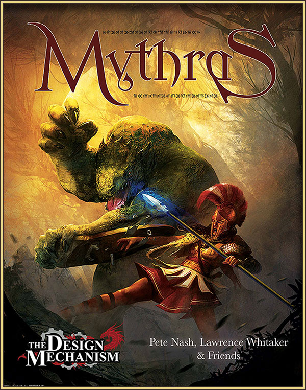
My copy of The Design Mechanic's Classic Fantasy arrived this afternoon. It's a companion volume to Mythras, with the intent of helping people to basically play AD&D with Mythras. I expect it could also be used successfully in conjunction with Runequest 6.

I haven't yet read through it in any depth, but I have some comments to make about the physical production values of the volume. This review will not touch on the content at all.

From the outside, the hardback book looks good. The cover is printed in bright, saturated colours, and it has a pleasing satin finish.

Mine arrived with one corner a bit munched, presumably courtesy of our various postal services, who aren't known for their careful, delicate touch.

The binding is pretty standard for PoD books of this type: it's basically a perfect-bound (i.e. glue, not stitched) book that has been mounted in hard covers. That's not necessarily a terrible thing; such bindings can be quite durable, but there's no real way to tell until it's had some use.


The interior is less impressive than the cover.

The page stock is very light and flimsy-feeling, even lighter than regular printer paper — I'd estimate maybe about 80gsm, and there's quite a lot of show-through between pages. It all looks like it's been printed on toner-saving mode; the blacks are very washed out and grey. In fact there's absolutely no pure black to be seen anywhere inside the covers.

I've shown it here alongside Black Blade's imprint of OSRIC, and the difference in print quality is marked.

Text blocks are laid out in a fairly weak serif font at a somewhat small size, which creates a low-contrast reading environment. That would be less apparent if the printing was better. As it is, large masses of text are quite tiring to read, especially if lighting conditions aren't perfect.

Box-text is even worse, since it's been given a mid-grey background, on which the slightly darker grey of the text sort of disappears.

Interior illustrations are all reasonably competent line art; there's nothing very surprising or original there. I haven't found any that are particularly inspirational, but they're not terrible or amateurish, which is a mercy.

All in all, I'm less than impressed with the production values of this volume.


Some time later...

My copy of Mythras arrived, via DTRPG. To my great relief the production quality is very much better. The paper stock is heavier, and the printing is properly black and white.

I'm (slowly) reading my way through it now. I suspect that if I attempt a campaign at all with this sort of system, I'm more likely to be using BRP as I prefer its more milieu-generic nature.

Wednesday, 14 April 2021

GURPS 4e in physical form

NOTE: This review concerns only the physical manifestation of the rules; I make no judgement whatsoever here about the usefulness of the GURPS rules and system for roleplaying games.


The first half of my GURPS 4e order arrived today. 

I ordered the Characters volume from the Book Depository (it hasn't arrived yet) under the impression that I was getting the set of two books. Then I realised that I'd ordered only the one, so I ordered the Campaigns volume from Amazon, and it arrived on my doorstep this morning.

I think this edition is GURPS's first foray into signature-bound hardback publishing. I don't really care one way or another about hardcover/softcover books for roleplaying manuals. As long as the glue used for softcover perfect-binding is adequate to the task so that pages don't start falling out, that's fine by me, though signature binding is always going to be harder wearing if it's done even half-way competently. This appears at first sight to be well bound, but that's not something that is easy to determine until the book has been in use for a while.

As an aside, I recently bought a copy of WotC's 5e Tasha's Cauldron of Everything book, which is the worst of both worlds. It's really just a badly perfect-bound book stuck into hard covers, and the binding is really shit. Anyway. Back to GURPS 4e.

Let me say at the offset that I hate the paper. It's a very bright white, glossy stock. That's no doubt excellent for making the colour illustration pop, but it's hard on the eyes when reading dense blocks of text (of which there is a lot) and it feels kind of nasty to the fingers.


The illustration style is competent enough, though not particularly inspiring. It's in colour throughout, which is another new thing for GURPS. Again, it's not something that I require in a RPG manual; black & white illustration is fine by me as long as it is informative or evocative (or preferably both).

What is useful about the transition to all-colour publishing is that each chapter has its own full-bleed coloured page borders, which (once you get to know which colour refers to what) makes navigating the book much easier. The colours are easily visible even when the book is closed, so you can go straight to the relevant section with an absolute minimum of page-flipping.

I'm not enthralled with the serif typeface choices, but I have to admit that I've seen worse. The impression I get is one of "good enough" conservatism in layout design.

The glossary and index at the back of volume 2 Campaigns covers both volumes, and appears at first glance to be pretty comprehensive. Of course, only extended use will show that for sure.

In the end, what matters is whether or not this hardback full-colour glossy format is a genuine improvement over GURPS's old softcover black & white books. I'm not convinced that the advantages are significant, but I am aware that I am of an older gaming generation and that The Youth these days won't look twice at anything that isn't ALL THE COLOURS, so I guess from a commercial point of view, it's a necessary change.

Saturday, 10 April 2021

AD&D2e (revised) P.o.D.


These arrived today for me from DriveThruRPG.

They're print-on-demand softcover copies of AD&D2e (revised), originally published in 1995. When I ordered these, there was no hardcover option offered. However, I don't mind softcover RPG books at all.

The paper stock used for the P.o.D. publication is a bit heavier than that used for the original hardcover printing, and as a result these are fairly hefty books. The print quality is very good; it's not identical to the original, but it's very very close.

The original books were signature bound, and open flatter than the perfect-bound softcover without cracking the spine — it won't take a huge amount of use before the softcovers start looking less than new, but if that matters to you... well, I guess you'd just have to buy two copies, one for use and the other to sit on the shelf looking fresh and unused. It matters to me not one jot.

How durable the glue binding is I don't know, these things are always a bit of a gamble. I have perfect-bound books that have lasted for decades, and others that started falling apart within weeks of purchase.

I've included a comparison image below: the original is on the left, the DriveThruRPG P.o.D. is on the right. As you can see, the text is very crisp and clear, and so are the many (mostly pretty mediocre) colour illustrations peppered throughout the volumes.


Wednesday, 22 April 2020

More Monsters in (Disappointing) Book Form

I just received a copy of Volo's Guide to Monsters that I ordered from the Book Depository some time ago.

It's a D&D 5e bestiary. I forget now how much it cost; it was about standard for these 5e harcovers, so not particularly cheap.

It's 224 pages, but that's not really a very good indication of its contents, as about half of that is taken up with detailed fluff about certain traditional types of monsters like Beholders and Mind Flayers. The second half is made up of much shorter descriptions of monsters, but these too are padded out with fluff — and there are no new creatures in the book at all, as far as I can see; they're all monsters that have appeared over and over in previous editions of D&D. Originality is in short supply in this book, and if you have any of the Monster Manuals for any previous D&D editions, you can probably safely save your money and just use those.

Overall, the book reads like somebody's notes on the creatures appearing in their own campaign, with extensive campaign-specific filler that is, in my opinion, largely unnecessary and serves no real purpose except to inflate the page count. It might be good for a GM who is entirely lacking in imagination or inspiration for their own campaign, or one who is very new to world-building, but for most GMs with any experience, it's not that useful at all.

Unless you're not comfortable with converting monsters from older books for use with D&D5e, or you're brand new to D&D and want some help with monster "colour", I'd say that you probably don't need this book.

Tuesday, 3 December 2019

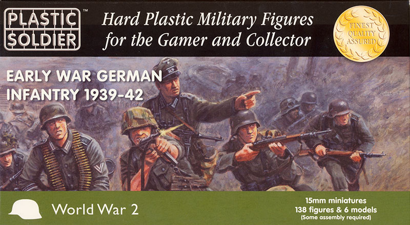
PSC 15mm Early War Germans

These just arrived for me today, a box of PSC's 15mm plastic German infantry for the first half of WWII.

On the box it says "138 figures and 6 models" — I'm not sure to what they refer when they say "models", unless maybe it's the 50mm mortar and anti-tank rifle teams which need to be assembled.

At about 22 quid (roughly forty KiwiBucks at the current rate of exchange) for in the region of 150 figures, they're not bad value. They're a lot cheaper than any metal alternative, as well as being substantially cheaper than Battlefront's plastic offerings in the same scale.

There are twelve sprues in the box, three with command and support personnel, and nine sprues of your regular grunts.

On each of the "grunt" sprues, you get eight riflemen in various poses armed with the Kar98, and two MG34 teams (gunner and loader), one standing, one prone.

The figures are somewhat soft of detail, as is common with injection-moulded plastic, but they're not too bad, and they're satisfyingly chunky compared with some of PSC's earlier offerings. The sculpting is decently round, taking into account the limitations of the medium, and they don't look as flat as some injection-moulded figures do (such as some of the figures from their companion set of early-war support weapons).

The "command" sprues give you a senior officer in a peaked cap, five junior officers and/or NCOs with MP40 submachine guns and other weapons, including one with what appears to be a signal pistol. It also contains components to assemble a 2-man 50mm mortar team, and a 2-man ATR team.


Overall, I like them. The sculpting is good, and there's a lot less multi-part assembly required than I've experienced with some of PSC's other sets, such as their late-war German grenadiers or their Soviet infantry. They look to me like they'll paint up well.

The weapon mix is more suitable for the latter part of the period they're intended for, as there are more MG teams available than would have been present in the campaigns in Poland or France, for example. However, they did soon start to bump up the number of MG34 per section, so I guess it's better to have them supplied than not.

All in all, I'm pretty happy with them.

Friday, 18 May 2018

PSC 6pdr & Loyd Carrier (15mm) — review

Here's another British WWII gun and tow in 15mm (1/100) from the Plastic Soldier Company, this time the 6pdr (57mm) anti-tank gun and Loyd Carrier.

This is a pretty nice pair of models, very easy and straightforward to assemble, which come in a box of four sprues. The carrier and gun are on a single sprue, along with crew figures and various items of stowage — mostly ammo boxes. I especially like the modeling of the canvas tilt, which has a bit more of a fabric-like character than many injection-moulded examples I've seen, and it sits very snugly over the sides of the Loyd.

The only assembly issue I had was with the fit of the axle stubs and sockets; they were all too tight to press-fit without risking bending or breaking something. A few swipes with an emery board loosened them up sufficiently though. The same was true of the mounting pin for the gun barrel.

The carrier can be assembled without the tilt, and four seated crewmen are included, as well as figures to represent the gun crew in action.

In this picture they're just held in place by bits of BluTak, as they'll need to be painted separately and then glued in place. Trying to paint them in situ would be a nightmare.

There's no rolled-up tilt included amongst the stowage, so if you want to represent that on a top-down model you'll have to provide it yourself, one way or another.

 The instruction sheet is a little clearer than most I've seen from PSC, both in terms of image quality and instructions. It could still do with some improvement though; the instructions for their kits are PSC's weakest point, I would say.

For example, the sheet mentions installation of the fuel tanks, but it's not completely clear how or where they fit except by their shape. Likewise, the exact placement of the seated crew is rather vague according to the instructions, but I notice there are four square pads on the floor of the carrier which I have assumed are where the crew seats are.

The exposed engine housing is nicely represented, and in this picture you can also see the ammo cases and what-not that fill up the side bench-seats. They're quite nicely modelled, but if you want to use the Loyd as a troop carrier, you'll want to leave them out and fill up those benches with squaddies from some other source.

I have had some difficulty tracking down where and when the Loyd was first used in action. I've seen one photograph of one in Italy in 1944, but apart from that I don't think they saw active service until after D-Day, in the ETO.

The 6 pounder represented is the later version, with the stepped barrel and muzzle brake. It could be used as the early model 6 pounder, sort of, by cutting off the muzzle brake and ignoring the stepping of the barrel. The gun can be assembled either in its action configuration, or towed, but not both — or at least, not without using two separate models. There are two barrels provided on the sprue; one as shown here, and the other with what I assume is a muzzle cover in place, for use if the gun is to be depicted towed. There are also two sets of wheels with different hubs and tread patterns, and I'm not really sure why that is. I would have to do a bit more research to find out, if I were so moved.

In brief, this is a nice, well engineered pair of models, and the Loyd isn't easy to come by in this scale — certainly not for this price. I'm very happy with them.

Later:


I was pointed towards this Australian film of a pair of Loyds on the back of a truck outside Alexandria.

They appear to be part of a Valentine tank unit, so are probably the Starting and Charging variant rather than gun tows.

Thursday, 17 May 2018

PSC 15mm 25pdr & Quad

Click on the pictures for larger versions
The 15mm (1/100) 25 pounder gun-howitzer box set is a pretty useful and flexible purchase for anyone fielding a WWII force. The 25 pounder served, in one form or another, throughout WWII and after, and in every theatre of operations.

This set offers options to build an early or late model 25 pounder on either a Mk.I/II or Mk.IV carriage, or an 18/25 pounder on the Mk.I/II carriage, or the 17 pounder Pheasant anti-tank gun on the Mk.IV. The limber is included on the guns' sprue, while the CMP Quad tow vehicle is on a separate sprue, and can be built with or without a canvas top cover. Mine is intended for North Africa, so I've built it without. (Note: PSC also offer a set with the Morris Quad.)

There are crew figures supplied suitable for the African or European theatres, and they're reasonably well sculpted, if a little soft of detail. All of the helmeted ETO figures have hessian scraps in their helmet nets, so if you want an early-war crew in battledress, you'll have to do some head-swaps, or sand down the clutter on the helmet covers.

The Guns and Limber

There are four gun/crew sprues in the box.There are sufficient parts on each sprue to build one gun and a limber, or two guns, one on a Mk.I/II carriage and the other on the Mk.IV.

Or, you can do as I did, and cheat: I used InstaMold (like Blue Stuff) to make a two-sided press-mould of two of the wheels so that I could do both guns and a limber. I cast the new wheels in 5-minute epoxy.

To be honest, it seems a little parsimonious of PSC not to have just included a couple more wheels on the sprue. There's room enough for them.

The guns go together pretty easily, though I got some parts the wrong way around at first and had to re-do them. The instruction sheets aren't some of PSC's worst by any means, but they could definitely still be clearer.

As you can see from the photo, I built an early model 25pdr and a Pheasant. There's only one hanger supplied (the connecting frame between the gun carriage and the turntable), so I didn't bother with it on the Pheasant. It would be a fairly simple thing to scratch-build, but I didn't think the effort worth while for my purposes. And besides, I vaguely recall reading that it tended to be left uncoupled on the Pheasant in any case, as the massive recoil of the 17pdr had a tendency to rip it off!

The limber, like the guns, went together very easily. Regrettably, there's no option to model it with the doors open, as they would be in action, and it's also missing the canvas cover that shrouded the connection between the limber and towing-pole — that will have to be added from putty or whatever if you want it present.

The Quad

For the most part, the quad assembled as straightforwardly as everything else, but with one exception: the roof.

The locating rim around the edge of the rear portion of the roof piece does not fit with the sides and rear. To get the roof to sit flush on the sides, you have two options: either shave down the inside top edges of the sides and rear pieces, or shave down the roof piece itself. I chose the former as the easier option. The plastic is fairly soft, so it didn't take all that long, but it was an irritation nevertheless.

I built mine as the open-topped version. In the desert, you pretty much had to choose between letting the air in or trying to keep the dust out, and since the dust got everywhere in any case, the choice was generally pretty easy to make.

Unfortunately, there's no piece supplied for the rolled-up top cover tarpaulin, so that's another piece that will have to be scratch-built or sourced elsewhere.

Summary

This set is not without its faults, but they are very minor. The fitting of the quad roof might cause problems for someone quite new to plastic modelling, but not to anyone with any experience.

The faults, such as they are, are far outweighed in my view by the flexibility and usefulness of the options offered. As such, it's good value.

Tuesday, 8 May 2018

PSC 15mm Churchill — first look

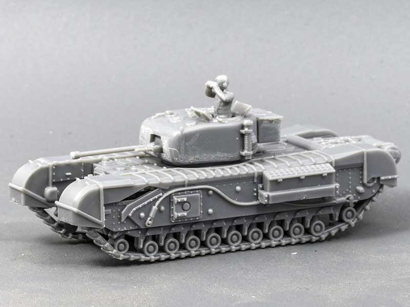
Here's my first look at the 15mm (1/100) Churchill from the Plastic Soldier Company. I've built this one as the cast-turret Mk.IV with the 6-pounder gun.

I wasn't quite sure what to expect from this kit. My only previous experience of a plastic Churchill kit was the fairly ancient Airfix model, with its horror-show running-gear of a bajillion tiny pieces. This one, however, was an absolute breeze to assemble, possibly the easiest of all the 15mm PSC tank kits I've tried so far.
Sprue layout and assembly options

Assembly instructions
There are five version options offered from the parts included on the sprue, the earliest model being the Mk.III.

I don't know enough about the Churchill to be able to say how easy or difficult it might be to convert this kit to a Mk.I — though I'm sure it's possible.

Instructions are given only for the Mk.III turret, but it's not difficult to work out what's needed for any of the other versions.

Monday, 7 May 2018

PSC 15mm M3 Stuart "Honey" — first look

 The M3 Stuart "Honey" from the Plastic Soldier Company in 15mm makes up into a good representation of the original, and at the usual £20-ish for five models it's pretty good value.

However, there are a few things to be aware of before you launch into building these kits. More things than usual, in my experience of PSC kits, but nothing too intractable — for the most part the engineering is pretty good, but see below for my notes about the fit of the running-gear pieces.

NOTE: I am informed that the Honey in British service had the sponson-mounted machine-guns removed. Fortunately it's a simple matter to chop these ones off, and one of the sets of side-plates provided on the sprue has those points blanked off, which I will hopefully remember next time.


The usual PSC version display, colour-coded
for your inconvenience


WARNING! DANGER!

As usual, PSC have provided a colour-coded layout to show you which parts are for which version.

WARNING!

The hull-top parts are mis-coloured, and the one used for the British "Honey", which should be in green, is actually shown in red.

I found this out when I tried to get the track pieces with sand-guards to fit, and could not. Fortunately the cement holding it to the hull-bottom had not yet set hard, and I was able to prise the two pieces apart and fit the right one.


 The instruction sheet shows the process for building the "Honey" only, and nothing at all for the other two (American) versions of the machine.

Fortunately that doesn't affect me, since I'm only interested in the British version.

The illustrations are easy enough to follow, better by far than some of PSC's instruction sheets, but the pictures are still a bit dark and low-contrast. I've cleaned them up considerably for this illustration.

NOTE: If you glue on the auxiliary fuel tanks as shown in the last picture before you have the turret in place, you will not be able to get the turret on without shaving off its locating lugs. Also, with the tanks in place the turret will no longer rotate 360°.


The only major issue I had with the fit of the parts was with the running-gear pieces with the sand-guards — they would not seat seamlessly against the hull top, and left a large and obvious gap along the front outer edge.

I found that what I had to do was to shave down the front half or so of the back of the piece — I've outlined the relevant area in the illustration — until it was flush with the front sprocket moulding. Then the piece settled properly hard up against the mudguard-edge.

There is still a visible seam, but it's not nearly as bad as it originally was. I assume this won't be an issue for the American versions, as they don't have to align with the sand-guards.

Wednesday, 2 May 2018

PSC Valentine (15mm) — a first look

Twenty quid, roughly, gets you five sprues of 15mm (1/100) Valentines from The Plastic Soldier Company. Each sprue contains parts to build one of either a Valentine Mk.II, Mk.III, or Mk.IX, with or without desert sand-skirts.

For my test model, I've built a Mk.II without sand-skirts.

It's an easy enough model to build (though see below for my comments on the instructions) and it seems to have been pretty well engineered. The turret is the fiddliest component, being comprised of six parts, but everything locates quite well and I didn't really have any trouble with it.

I haven't checked the model's dimensions, and to be honest I probably won't bother. It looks right to me, next to other models in the same scale, and that's all that I need for wargaming purposes.

There are some things to be aware of though, before you start building these kits. If there's one area where PSC consistently fall down with their plastic kits, it's in their instructions.

The parts are numbered on the tooling layout, next to the illustrated instructions, but they're not numbered on the sprue itself — something that may take people coming from other manufacturers by surprise.

Version colour-coding sheet —
doesn't match actual sprue.

Tooling layout and
assembly instructions


The assembly illustrations are quite small, low-contrast, and indistinct, and since parts aren't numbered, it requires a bit of checking back and forth to make sure that you have the right parts for the version of the Valentine that you want to build. The vagueness of the illustrations means that it could be quite easy to get parts attached upside-down if a modicum of care isn't taken, as it's impossible to distinguish orientation from the pictures.

Most irritating to me is the fact that the colour-coded sprue layout shown on the reverse of the instruction sheet, designed to show you which bits go with which version, doesn't match the layout of the actual sprues in the box. That's a pretty glaring flaw, in my view.

In summary: good little model, terrible instructions.


Valentine Mk.III

Valentine Mk.IX (-ish)

Later...

Something I failed to mention, and should have, is that although there are parts on the sprue to build only one tank, it is possible to build separate turrets for all three versions of the Valentine.

It would be possible, with some work and care, to make the hull-tops (with or without sand-guards) swappable by means of magnets. However, it would be a bit of a faff, and for my money I'd probably just as soon buy another box of models.

Note that the running gear for the Mk.IX has a slightly different pattern of bogies, and separate track pieces are provided for it. However, the visual difference is really quite minimal, if you prefer to have the flexibility of swapping the three turrets around between a common hull.

There are three commander figures provided on the sprue, but one of them is a Soviet, wearing their distinctive ribbed tanker's helmet. It would probably be possible, if you really want to, to convert its head to a beret-wearing Brit, but it's more work than I care to do.

Thursday, 1 March 2018

Chinese Plastic People

I bought some tiny plastic people, described as "architectural figures", from China, via AliExpress.

They were advertised as being 1/300 scale, but the standing figures are about 9mm tall, which would make them closer to 1/200.

I intend to use them separate from my vehicles and what-not in any case, so the scale differential is not a huge deal. They'll mostly end up as bases of hapless refugees and the like.

They cost almost nothing; about a buck and a half for a hundred of them. So, I've got 500 potential displaced persons.

Friday, 8 September 2017

PSC 15mm Infantry

I recently got some stuff from the Plastic Soldier Company, amongst which is a set of their early WWII German heavy weapons, and amongst them is this flamethrower figure.

It's fairly representative of the standard of PSC's infantry figures.

Size and proportions are generally OK, though there are some odd quirks, like the bulginess of this guy's back to the right of the flamethrower tank. Detail is pretty soft though, and the poses tend to be quite flat to cater to the limitations of injection moulding. They're intended as wargaming figures, and in that role they serve perfectly well. They're not in the top rank of quality as far as detail and animation goes, but for their intended purpose they don't really need to be. They do take a bit more painting than figures with crisper, cleaner detail, so be prepared for that if it's something that is important to you.

I've yet to see any of Battlefront's plastic figures, PSC's only real competitor so far in the field of 15mm plastic figures, so I can't make any comparison except on price. The BF plastics are considerably more expensive and less comprehensive than PSC's offerings. If you want superior detail, metal figures will probably have the advantage, but again you'll be paying a lot more for them, and quality there is far from guaranteed — I've seen some truly awful metal figures.

In summary, I think they're OK. Not stellar, but OK, and worth the asking price.

Tuesday, 22 August 2017

Portable Light Box

 I bought this portable light-box from a company called Upkeep Yoga for fifty of those Yankee dollars. It is, perhaps unsurprisingly, not as good as they made it look in the product shots, but it's not completely worthless.

The shell is what appears to be ABS plastic, and it's supposed to be held in shape by magnets. The magnets aren't strong enough for the job, and their placement is... inexact, to say the least.

It is lit by a single USB-powered LED strip, which provides barely adequate diffuse lighting. I won't be doing any hand-held shooting under this light.

It comes with two foam mattes: one white, one black-ish. They're OK; they create an adequately seamless background. How easy they will be to clean I don't know.


I will need to do some tinkering to see how best to set my camera for use with this box. These are on the white and black mattes, without any exposure compensation at all. With the puny amount of light shed by the LED strip, the black matte required about a second and a half of exposure at ISO 200, the white matte about 1/15.


These are from the RAW files, with quick EV compensation (but nothing else) applied in Lightroom.

In summary, it's not a worthless bit of kit, but it's far from stellar. It will be of some use on the road (which is its function, after all), but it's hardly going to replace my current photographic setup.

In-camera +2 EV compensation

Auto-bracket + HDR and Levels adjustment
These two images I've taken to try out some in-camera adjustments.

On the left, the photo was taken with a +2 EV compensation.

On the right, I've auto-bracketed by ± 1 EV, merged the three exposures into a HDR image, and then adjusted the levels to get a pure white background.

Of the two, I think I prefer the simple +2 EV exposure. Apart from anything else, it looks sharper to my eye.

Monday, 9 January 2017

Dwellers in Dark Places — a New Monster Book

This book of monsters for AD&D/OSRIC by Matthew Hargenrader, Dwellers in Dark Places, has just arrived on my doorstep — at long last; I ordered it from DriveThruRPG a couple of weeks before Xmas last year.

I bought it in PDF format some months before then (about September, I think) and enjoyed it enough to shell out for the PoD hardcover when it was marked down (about 20%) for the pre-Xmas market.

It is, without doubt, the most entertaining book of RPG monsters I've seen in decades. I haven't enjoyed a critter collection as much since I got my brand new copy of the Fiend Folio in 1982.

It's thoroughly illustrated in black-&-white throughout, and generally, the illustrations are pretty good — to my mind, they're of a much better standard than the usual run of fan-published work. There's something to be said for the enthusiasm of amateurs, but it's refreshing to see such a solid body of professional-quality black-&-white artwork. There's nothing there, alas, by Pete Mullen (one of my favourites), but I guess you can't have everything. There are about 500 monsters detailed in the book, and almost (?) all of them have at least one illustration, so that's a lot of pictures.


The paper is a bit thin, and not terribly opaque, but considering the page count (366 pages, not counting the front- and end-matter) if the paper was as heavy as that in the first Monster Manual and Fiend Folio, the book would be about two or three inches thick. Not that I'd particularly mind that.

The organisation and layout follows the precedent set by those earlier works, though in places it betrays a certain amateurishness. The most obvious example is in the tables that are scattered liberally throughout the book; they are all dominated by thick black borders which overpower the text within, and make the whole table less legible.

Another example, and a more serious one from the point of view of the book's usability, is that all too often monster statblocks and descriptions/illustrations are spread across more than one page. That's not really an issue as long as they're on the same two-page spread, or at least start on the same spread, but frequently I see a statblock table on a right-hand page that refers to a monster that is detailed on the following page — and that description is lacking any sort of title or visual separation from the previous entry. That's just bad design.

However, even with these reservations, I like this book a lot. It has obviously been a labour of love for the author, and it's jam-packed full of critters that I'm champing at the bit to use.

I hope it makes him a MEEEELLLION DOLLARS!

These also arrived today, in a separate delivery: ten 24-sided dice from the faraway land of China.

I've made my love of Stupid Dice known before.

I can't foresee very many uses for these, except maybe to randomly determine an hour of the day, so you'd think there would be no point in getting more than one. Or even one, for that matter. Ten certainly seems like overkill.

However, they were only about a buck-fiddy for a bag of five, with free postage, so really I think I should be congratulated on my self-restraint in only getting ten.

Monday, 29 December 2014

Hobbit III: MEGABRAAAAAAWL!!!!!

Warhammer!
I wish I had said it first, but I didn't. Zak S said it, and I absolutely, thoroughly agree:
"Hobbit: Battle of 5 Armies may not be very faithful to Tolkien but it is really faithful to Warhammer Fantasy Battle which is a way better thing to be faithful to. It is the Warhammer Fantasy Battlest movie ever made . #wargoats"
 I thoroughly enjoyed this movie. I liked the first two a lot better having seen the extended versions, which put back in a lot of bits and pieces that I'd missed, but of the three I enjoyed this one the most.

I will spoiler no spoilers (though I doubt that there's much there to be spoiled because frankly it's not a movie of great subtlety), but I will say this: you really, really don't want to piss off Galadriel, because she will fuck your shit up.

Friday, 14 November 2014

The Dip

A mass-production miniatures painting technique that has really taken hold in the last decade or so is auto-shading by using glazes or washes of various formulations. Vallejo and Citadel both produce water-based washes in an increasing range of colours, and when used sensitively they can create excellent, subtle shading with minimal effort.

For wargames figures, less finesse is required. The miniatures are intended to be viewed at arm's length or further, so the shading results can (and probably should) be less subtle. Plus, wargaming figures benefit from being well protected from the vicissitudes of handling by a good, sturdy sealing coat.

Here are a couple of alternatives to achieve that end.

On the left, Army Painter Quickshade (Dark Tone). Quickshade comes in three strengths of tone, so you can use whichever best suits the underlying colours. This 250ml tin cost me $45, which is not cheap.

On the right, Cabots Varnish Stain (Indian Tea). This can be tinted in a much wider range of colours. The 250ml tin cost me about $25 — slightly more than half the price of the Quickshade.

However, price is not the only determining factor when one is choosing a product. How do they perform? Both, as far as I can determine, do fundamentally the same job: both are oil-based, fairly low-viscosity, tinted varnishes.

Below are two varieties of Reaper plastic zombies. Each type has been block-painted and then just dipped in the stain — a crude method of application; brushing the stuff on would certainly give you more control.

Of each type, the Quickshaded one is on the left, the Cabots Varnish Stained one is on the right.


The Quickshade gives you a much more subtle shading effect than does the Cabots, which is probably usually going to be preferable. I haven't yet tried thinning the Cabots to see if that ameliorates the chalk-and-soot effect — if it does, then its much lower price would make it a more cost-effective option. Both products do a decent job; if price is no object, my taste runs more towards the Quickshade outcome.

Both of them harden over about 24-48 hours to a a rugged, glossy finish. That means that unless you like your toys shiny, you'll need to hit them with a decent matte-coat afterwards. Some acrylic varnishes don't work or play well with oil-based underpainting, so that means that the matte-coat should probably be spirit based.


The Next Day...

I gave the zombies a squirt of Vallejo acrylic matte varnish to take the gloss off them, and it went on just fine. It doesn't seem to be bothered by the oil-based varnish underneath, which is good.

Something I've found about acrylic matte varnishes is that they really do work best sprayed. I've never achieved anything better than a satin finish by brushing them, while the identical varnish goes dead flat when applied through the airbrush.


Thinning the Cabots

Thinning doesn't work very well. I suspect that what it needs is not thinning, but dilution — I may get an un-tinted can and use that to get the exact degree of tint I need. However, there's not much point in that until I run out of Quickshade, and a pot does go quite a long way, especially when it's brushed on.