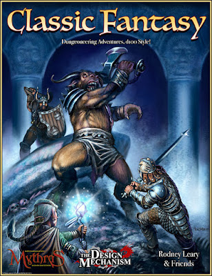
My copy of The Design Mechanic's Classic Fantasy arrived this afternoon. It's a companion volume to Mythras, with the intent of helping people to basically play AD&D with Mythras. I expect it could also be used successfully in conjunction with Runequest 6.
I haven't yet read through it in any depth, but I have some comments to make about the physical production values of the volume. This review will not touch on the content at all.
From the outside, the hardback book looks good. The cover is printed in bright, saturated colours, and it has a pleasing satin finish.
Mine arrived with one corner a bit munched, presumably courtesy of our various postal services, who aren't known for their careful, delicate touch.
The binding is pretty standard for PoD books of this type: it's basically a perfect-bound (i.e. glue, not stitched) book that has been mounted in hard covers. That's not necessarily a terrible thing; such bindings can be quite durable, but there's no real way to tell until it's had some use.
The interior is less impressive than the cover.
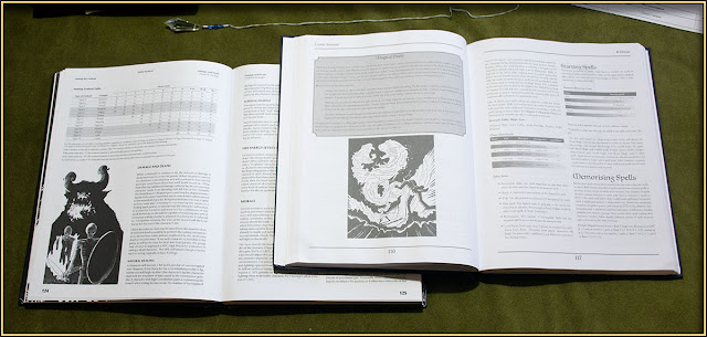
The page stock is very light and flimsy-feeling, even lighter than regular printer paper — I'd estimate maybe about 80gsm, and there's quite a lot of show-through between pages. It all looks like it's been printed on toner-saving mode; the blacks are very washed out and grey. In fact there's absolutely no pure black to be seen anywhere inside the covers.
I've shown it here alongside Black Blade's imprint of OSRIC, and the difference in print quality is marked.
Text blocks are laid out in a fairly weak serif font at a somewhat small size, which creates a low-contrast reading environment. That would be less apparent if the printing was better. As it is, large masses of text are quite tiring to read, especially if lighting conditions aren't perfect.
Box-text is even worse, since it's been given a mid-grey background, on which the slightly darker grey of the text sort of disappears.
Interior illustrations are all reasonably competent line art; there's nothing very surprising or original there. I haven't found any that are particularly inspirational, but they're not terrible or amateurish, which is a mercy.
All in all, I'm less than impressed with the production values of this volume.
Some time later...
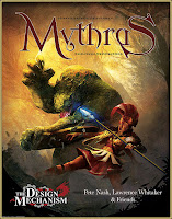
My copy of Mythras arrived, via DTRPG. To my great relief the production quality is very much better. The paper stock is heavier, and the printing is properly black and white.
I'm (slowly) reading my way through it now. I suspect that if I attempt a campaign at all with this sort of system, I'm more likely to be using BRP as I prefer its more milieu-generic nature.


That is a shame, how can anyone read that effectively?
ReplyDelete